Styled Panel
The Styled Panel is the right-side configuration panel that opens when you click on a field or a page on the canvas. It lets you configure properties and styling for:
- A page (the whole form page)
- An individual field
- Multiple fields at once via bulk styling
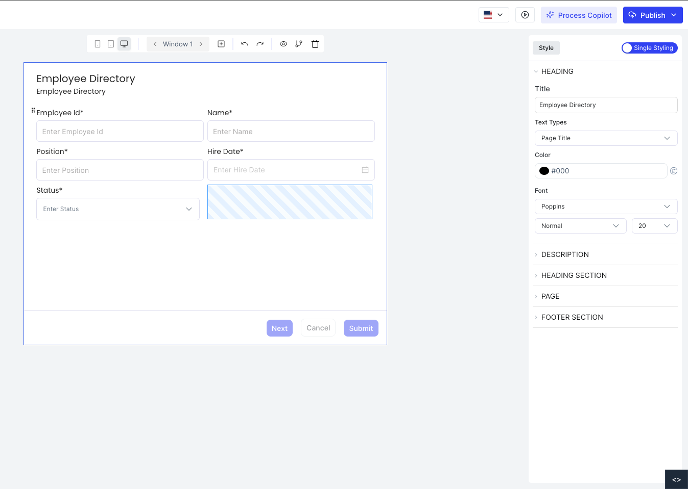
Accessing the Styled Panel
Click on any field or page on the canvas. The Styled Panel opens on the right side showing the configuration options for the selected element.
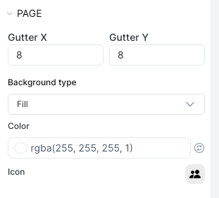
Page Configuration
Clicking on the page (not a specific field) opens the Page Config panel. Here you can set:
- Gutter X: horizontal spacing between fields on the page
- Gutter Y: vertical spacing between fields on the page
- Background Type: solid color, gradient, or image
- Background: the background color or image applied to the page
- Icon: an icon displayed alongside the page title
Individual Field Configuration
Clicking a field opens its configuration in the Styled Panel. The panel is divided into sections:
Configure the field label: title text, font, color, alignment, and size.
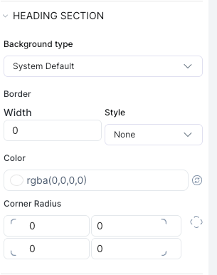
Common Properties
Across all elements (pages, wrappers, and input fields) you can configure:
| Property | Description |
|---|---|
| Title | The label shown to users |
| Placeholder | Hint text inside the input |
| Label Position | Left, center, or right |
| Typography | Font family, size, weight, color, line height, alignment |
| Background | Solid color, gradient, or image |
| Border | Color, width, style, and radius |
| Padding / Margin | Spacing inside and outside the element |
Bulk Styling
To style multiple fields at once, select several fields on the canvas (hold and drag to multi-select), then configure them together in the Styled Panel. All selected fields will receive the same styling changes.
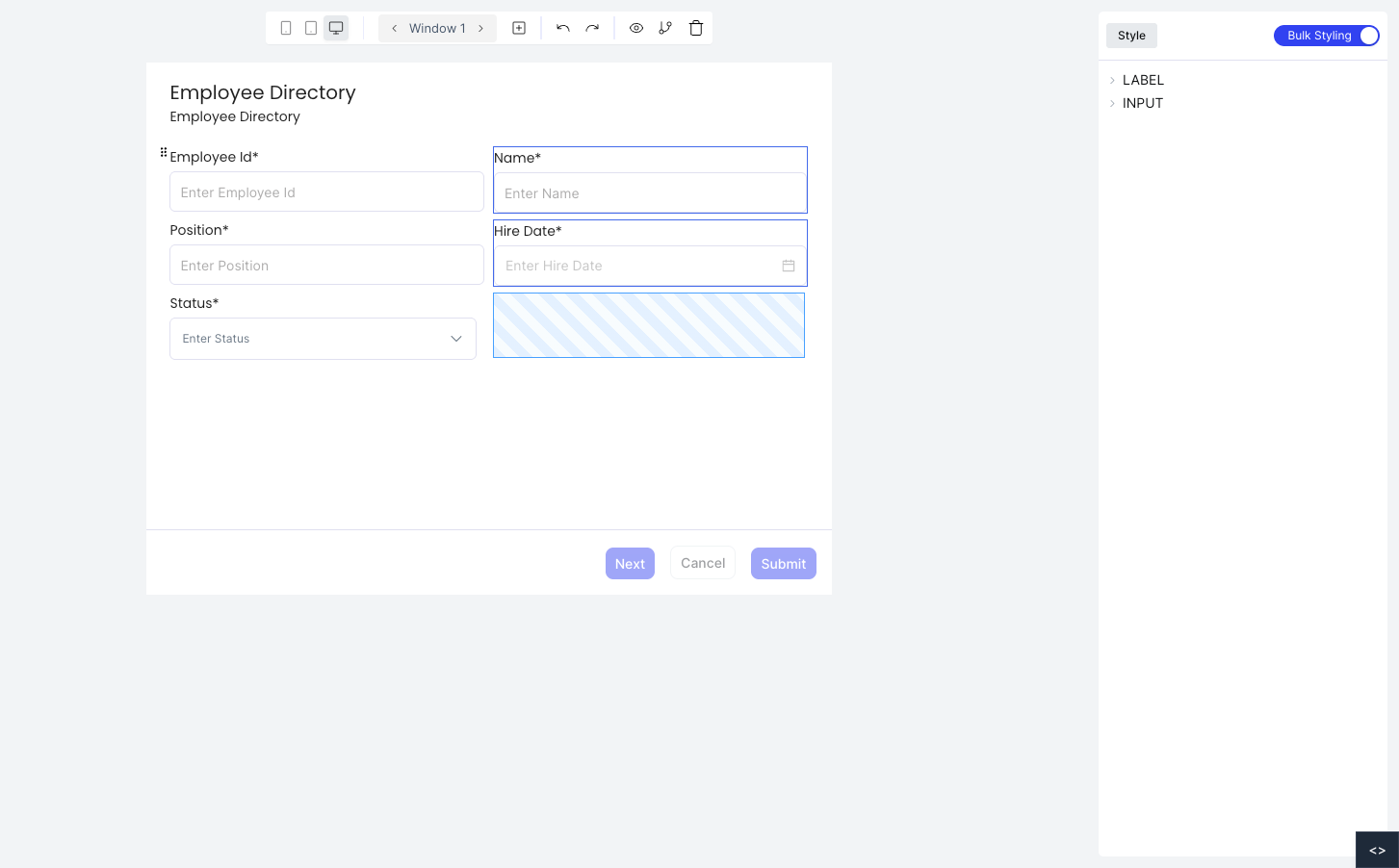
Bulk styling is useful for applying consistent typography or border styles across a group of fields without editing each one individually.