Button Customization
Every window has a set of action buttons that users interact with when filling out a form. You can enable or disable each button and customize its appearance from the Button Configuration panel.
Accessing Button Configuration
Open the window in the canvas, then click on any of the action buttons at the bottom of the window.
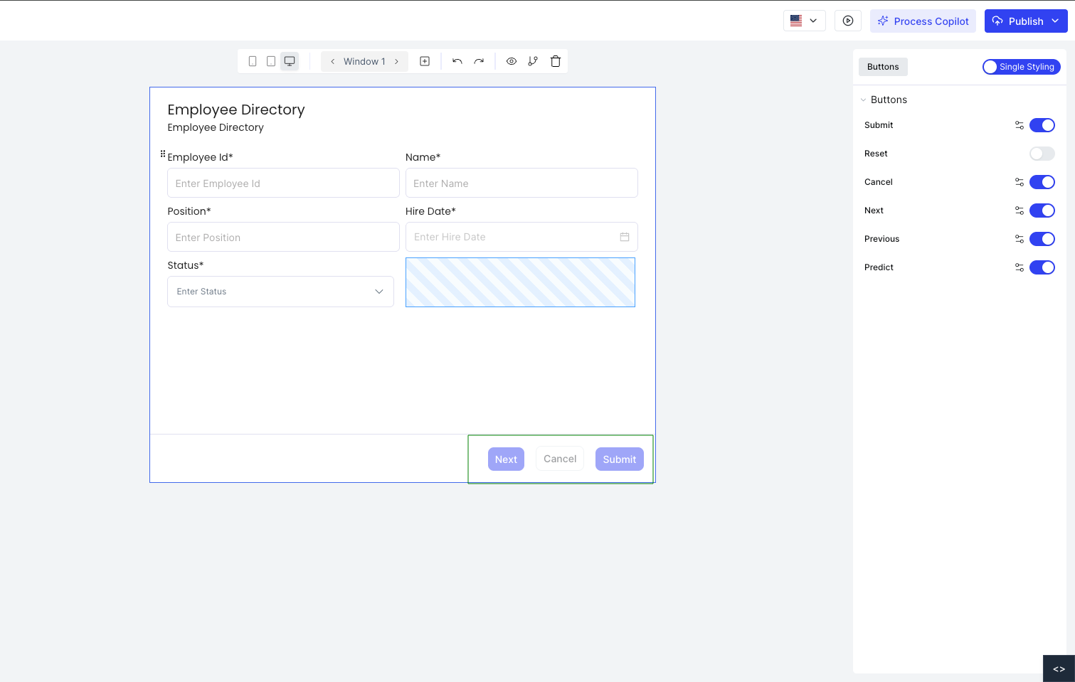
The panel lists all available buttons. Each button has a toggle to enable or disable it.
Available Buttons
| Button | Description |
|---|---|
| Submit | Saves the record entered in the window |
| Reset | Clears all data entered in the form |
| Cancel | Cancels the current action |
| Next | Moves to the next page in a multi-page window |
| Previous | Returns to the previous page in a multi-page window |
| Predict | Triggers ML prediction if an ML mapper is configured for the window |
Next and Previous are only active in multi-page windows. Predict is only available when an ML mapper is mapped to the window.
Configuring a Button
Click the settings icon next to any button to open its configuration.
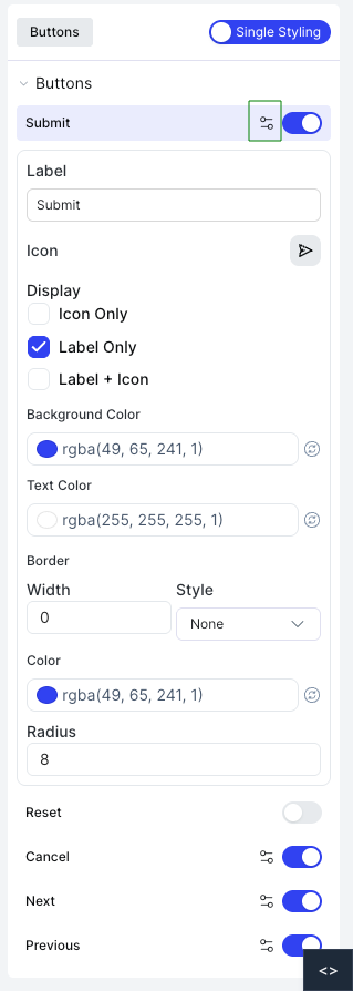
| Option | Description |
|---|---|
| Label | The text displayed on the button |
| Icon | An icon shown on the button |
| Display | Choose Icon Only, Label Only, or Label + Icon |
| Background Color | The button's background color |
| Text Color | The label text color |
| Border | Border width, style, and color |
| Radius | Corner radius of the button |
| Reset | Toggle to reset styling back to default |