Theme Editor
The Theme Editor lets you customize the visual appearance of your system. You can create new themes, edit existing ones, and activate whichever theme you want applied to the application.
Accessing Theme Editor
Click the Theme Editor icon (palette icon) in the left sidebar. The page lists all available themes as cards, each showing a preview thumbnail, a light/dark mode indicator, and an Activate button.
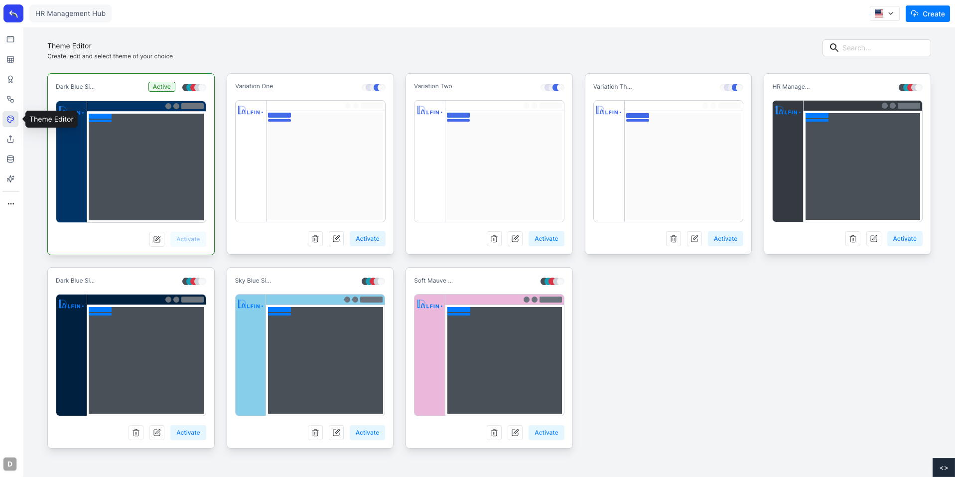
The currently active theme is highlighted with a green border and an Active badge. Click Create in the top right to create a new theme.
Editing a Theme
Click the edit icon on any theme card to open it in the editor. The editor has two main views toggled at the top: Dashboard and Component.
Dashboard View
The Dashboard view shows a live preview of the application with your changes applied in real time.
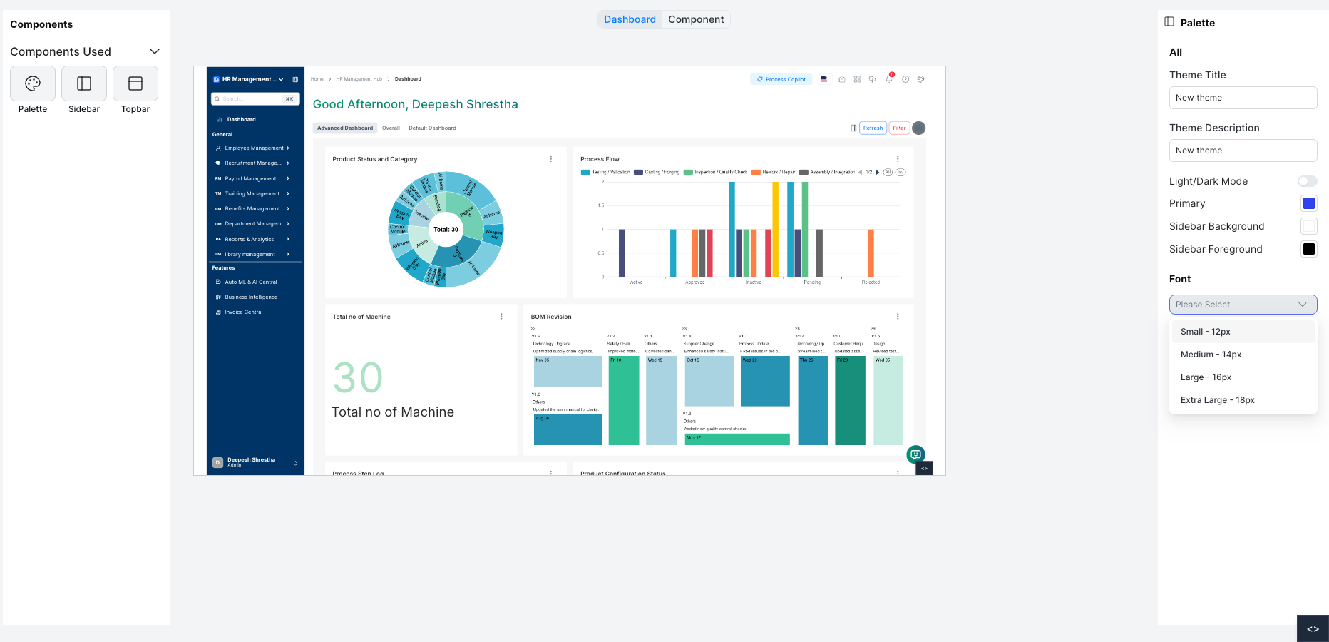
On the left, Components Used lists the parts of the interface included in this theme: Palette, Sidebar, and Topbar. Click any component to configure it.
On the right, the Palette panel lets you set the global theme properties:
| Setting | Description |
|---|---|
| Theme Title | Name of the theme |
| Theme Description | Optional description |
| Light / Dark Mode | Toggle between light and dark base mode |
| Primary | The primary accent color used across the UI |
| Sidebar Background | Background color of the sidebar |
| Sidebar Foreground | Text and icon color in the sidebar |
| Font | Global font size: Small (12px), Medium (14px), Large (16px), Extra Large (18px) |
Component View
The Component view shows individual UI elements so you can preview how they look with the current theme settings.
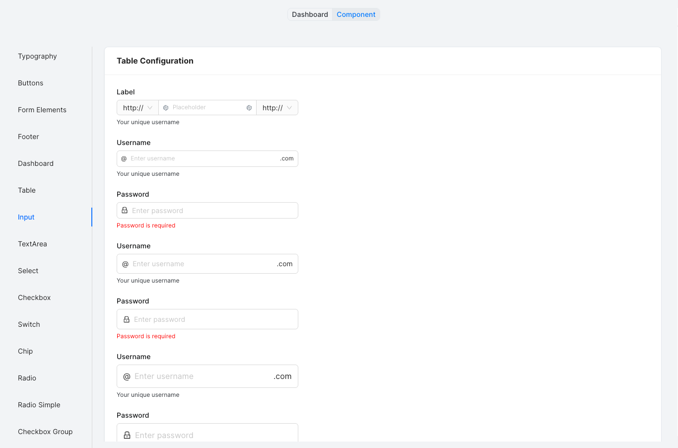
The left panel lists all components: Typography, Buttons, Form Elements, Footer, Dashboard, Table, Input, TextArea, Select, Checkbox, Switch, Chip, Radio, and more. Click any component to see its styled preview on the right.
Sidebar and Topbar Variations
When Sidebar or Topbar is selected in the Components Used panel, the right panel shows layout variation options.
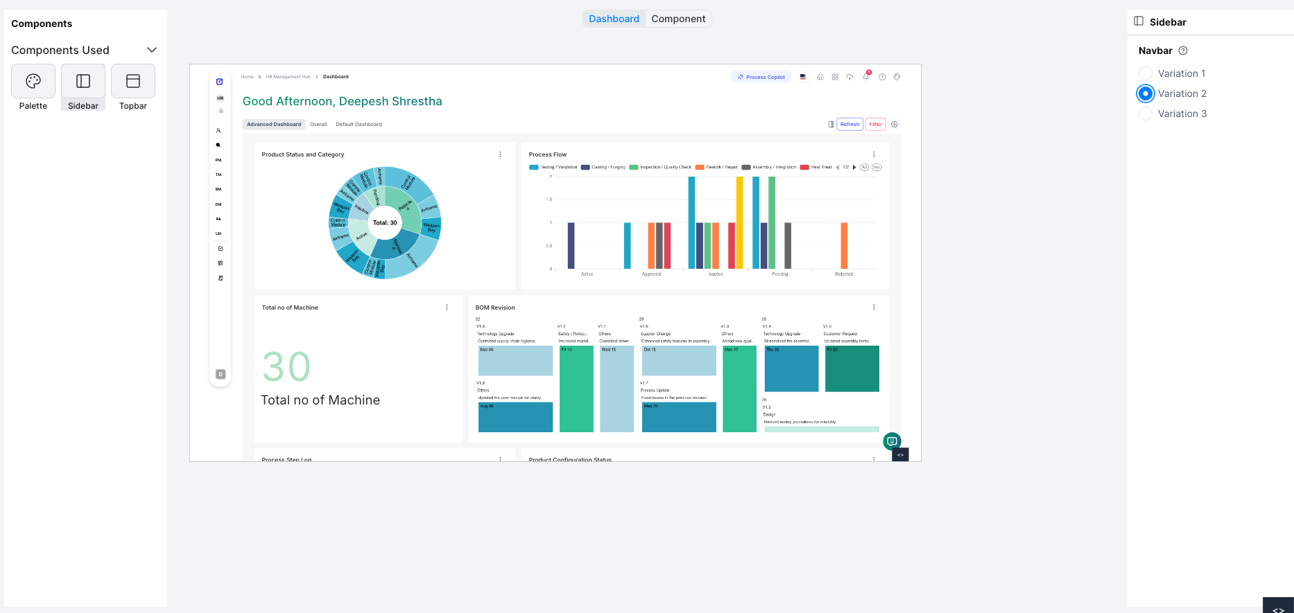
Select a Navbar variation (Variation 1, 2, or 3) to change the sidebar navigation style. The preview updates immediately.
Activating a Theme
Click Activate on any theme card to apply it to the application. The active theme is marked with a green border. Only one theme can be active at a time.
Deleting a Theme
Click the delete icon on a theme card to remove it. The currently active theme cannot be deleted.