Card
The Card view displays records as individual cards. You can choose from several card types to change the visual layout.
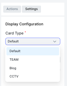
Card Types
| Type | Description |
|---|---|
| Default | Standard card with title, description, and optional image |
| TEAM | Card styled for team member profiles |
| Blog | Card styled for blog-style content with cover image and text |
| CCTV | Card styled for camera feed or image-focused display |
Settings
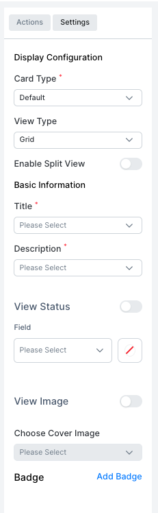
| Setting | Description |
|---|---|
| Card Type | Choose the visual style: Default, TEAM, Blog, or CCTV |
| View Type | Layout of cards: Grid |
| Enable Split View | Show a detail panel alongside the card list |
| Title | The field used as the card heading |
| Description | The field shown as the card body text |
| View Status | Toggle to show a status indicator on the card |
| Field | The field whose value is shown as status |
| View Image | Toggle to show an image on the card |
| Choose Cover Image | The image field used as the card cover |
| Badge | Add badge indicators to the card |